
KELLER CIDER
.png)
The cider category is crowded with familiar cues, rustic storytelling, busy labels, and brands that struggle to clearly articulate what makes them different.
Keller Cider wanted a brand that reflected the way they make their cider: clean-brewed, uncompromising, and rooted in British provenance.
The challenge was to create an identity that mirrored this process, celebrated 100% British-grown fruit, and stood apart from both traditional apple ciders and modern fruit-led alternatives.
The Challenge
The Approach
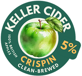
Sidekick developed a complete brand identity for Keller Cider, a small-batch Cornish craft cider producer focused on clean brewing — no added nasties, no unnecessary embellishment.
The brand was designed to be confident, restrained, and intentional, using clarity and simplicity as a point of differentiation. Every visual decision was made to reflect the product philosophy: if the cider is clean-brewed, the brand should be too.
What we delivered
-
Brand identity & visual language
-
Logo design
-
Packaging and label system across flavours
-
Supporting brand assets & merchandise
.png)

.png)


The Outcome
A modern, premium cider brand concept that feels credible, considered, and distinctive on shelf, demonstrating how clear positioning and disciplined brand design can cut through even the most saturated categories.
-
Differentiating in a crowded, commoditised market
-
Translating product truth into clear brand expression
-
Using restraint to increase perceived quality and value
.png)
